Citi loses $500M, and why verification UIs should switch modes
Updated:This is hilarious.
Last August, Citigroup Inc. wired $900 million to some hedge funds by accident. Then it sent a note to the hedge funds saying, oops, sorry about that, please send us the money back. Some did. Others preferred to keep the money. Citi sued them. Yesterday Citi lost, and they got to keep the money. -Matt Levine @ Bloomberg
Here’s the software interface that started the entire saga:
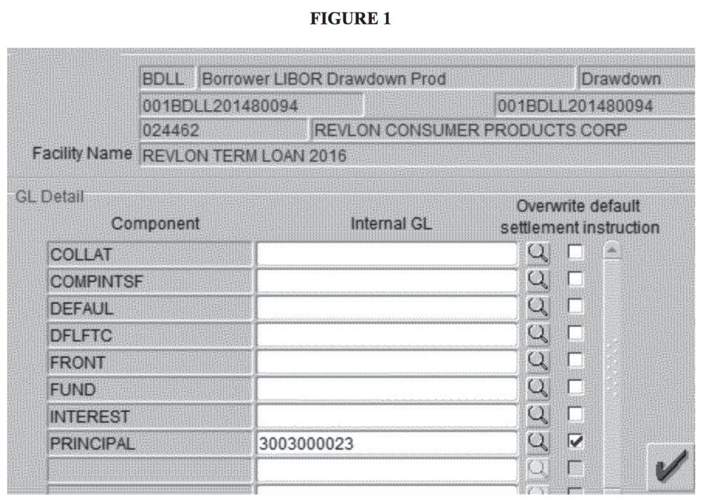
Yes this form is confusing, but I think the truly egregious UX occurred after this form was filled out.
It appears that the two approving users of that $900M wire reviewed the same input screen as Raj, who first initiated the transfer. Showing them the same UI limits the chance they’ll see an error. Alternatively, if they had reviewed a screen showing rows of recipients and pending wire amounts it’s likely they would have caught the mistake.
UI Principles
This exemplifies a UI principal I strongly believe in: verification UIs should switch modes.
If you rely on someone reviewing the same UI you are either asking them to be: 1.) more knowledgeable than the first reviewer, 2.) more observant than the first reviewer. Depending on a hierarchy of increasing reviewer competence is untenable. This is worse when you’re reviewing yourself.
Confirmation Emails
Consider traditional forms asking for your email address. Normally they ask you to enter your email twice. But if you were going to enter it wrong the first time, what are the chances you’d get it right the second time? A more common approach nowadays is to send a confirmation message to the email entered; i.e. a new mode.
Now you can capture a whole new realm of errors:
| Error | Double Entry | Confirmation Message |
|---|---|---|
| Mistyped address | ✅ | ✅ |
| Misremembered address | ❌ | ✅ |
| Misunderstood what the form wanted | ❌ | ✅ |
The signup form on my.equifax.com follows this old approach (and doesn’t indicate if it will send a confirmation email).

Airline Tickets
Airline ticket websites have this same problem. If you’re trying to double check the destination airport and the dates all you have to work with is the same 3-letter airport code or city name you typed to search and the text formatted date range.
![JetBlue selected flight confirmation. Fare: Washington-National, DC [DCA] - Orlando, FL [MCO].](https://photos.collectednotes.com/photos/2534/1b966427-c120-40c5-b424-0f891983f88d)
I think airlines should show you a map with the flight path overlaid. Seeing a flight I intended to book to Miami with a flight path to Orlando would allow a different part of my cognitive system flag the error. Including a statement like “departing in 9 days” would also let me think about the dates differently.
Examples in the Wild
Google, Birthdate Confirmation (Sept. 25, 2022)
Google requires you to enter a birthday in Month, Day, Year format (in the USA). Once you submit, it pops up a modal and states your age to use, as second mode of verification. For example, when I ran this I entered “April 12 1997” and it asked “You’re 25 years old. Is this correct?”.
