Android, the better UX?
Intro
What’s the best looking smartphone? Quickly the obvious response is given, “iPhone”. The leader in innovation, design, functionality, usability, friendliness… et cetara. I’d like to challenge this widespread assumptions and propose that, in fact, Android provides a better net user experience.
I’ll start off with one stipulation, this argument only holds merit if the large amount of sub-par Android apps is ignored. Android did not impose a solid set of design guidelines until relatively recently and there are many apps that continue to look outdated. Instead, I’ll focus on the new-breed of high quality apps gracing the Play Store as well as the core UX features of the Android system.
Reason 1: Alerts
Android has mastered all things notification; first on the list comes how it handles alerts. Android alerts user about a new notification in a subtle, non-instrusive way. It rolls the text over the statusbar then fades the statusbar back to its prior state. Unlike iOS, it never overlays the user’s current screen or interrupts the user’s flow.
First observe how iOS handles notifications:
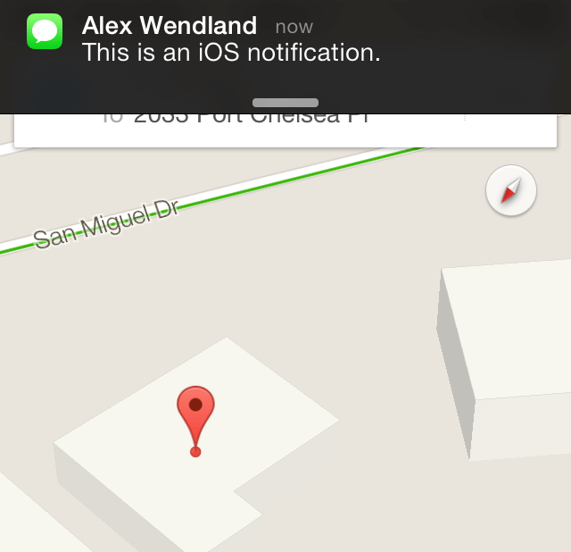
The user’s interactions with the top bar is completely disrupted! It is effective at catching the user’s attention, but it can popup with no warning and cause unwanted navigation away from the user’s current context.
Now take a look at Android’s implementation:
Notice how the effect is kept out of the user’s current application. This separation between the current activity and instrusive alerts is a smooth and calm compared to the abrupt, wrenching iOS experience.
Without the advanced access provided by Android’s notification drawer (the next item on the list), Android’s method of alerting users would be ineffective because it would only proivde the user with basic information and with no means to act upon it. This is why iOS provides clickable notifications, allowing for users to act immediately to the alerts. Android’s implementation is more contained and approachable as will be seen in the following section.
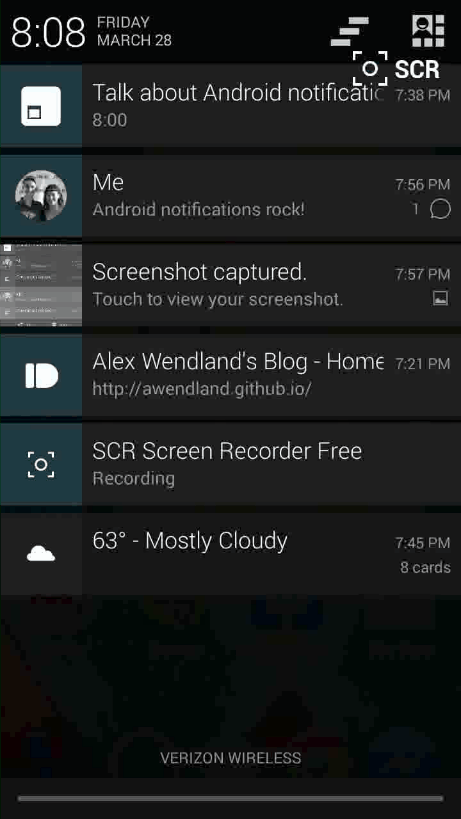
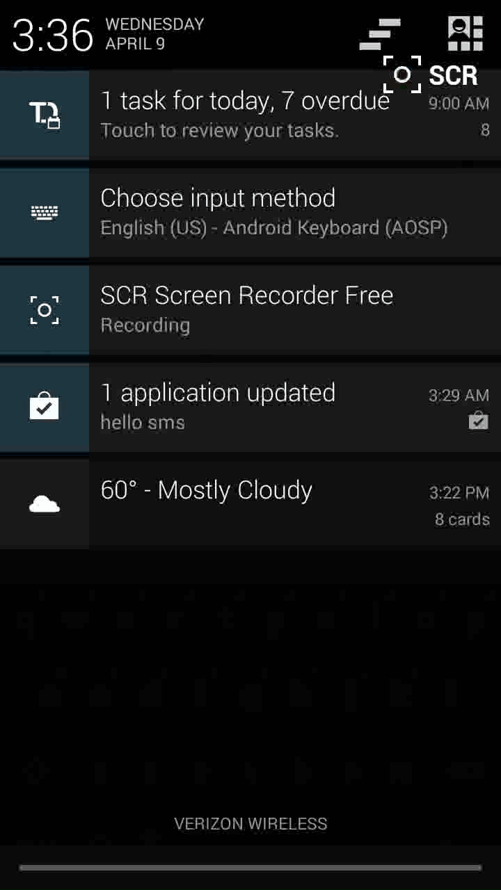
Reason 2: The Notification Drawer
The notification drawer is what keeps me coming back to Android every time that I try to migrate to an iOS device. The Android notification bar is a functional masterpiece; it always has your latest information, and it only has what you want. On top of that, it provides quick access to acting upon each notification.
Watch this demo a couple times:
This is what’s happening:
- An example notification drawer is shown filled with several representative common notifications: an upcoming calendar event, a text message, a screenshot, a received link, and an ongoing screencast.
- The notifications are all expanded with a drag-down gesture in order to reveal their action items
- The text message is marked read by clicking the ‘Read’ action item
- The screenshot is opened for sharing by clicking the ‘Share’ action item
- Both items remove themselves from the notification drawer once they are no longer relevent
There’s a couple important UX designs being implemented here. First off, notifications can take a wide variety of layouts. They can be compressed into easy-to-digest one-liners, then expand into complex layouts that are applicable to their purpose (e.g. the screenshot notification expands to contain a large thumbnail of the screenshot). Android notifications are able to provide the perfect amount of information for the user to act on.
This leads into the second point, Android notifications fill a useful niche that exists between quick-updates and the need for a full-blown application. Many times, the event that just occurred —be it an incoming text message, an ongoing phone call, or a calendar reminder— only requires a quick, simple interaction (such as acknowledging a message as read, hanging up the phone call, or delaying the calendar reminder). These actions don’t warrant a full context switch to a new app, they can easily be dealt with on the spot, and Android provides the means to do so.
Thirdly, Android notifications provide realtime, ongoing information. In the example, the screenrecording application had placed a persistant notification in the notification drawer in order to alert the user about the current state of their recording. Many Android applications do this, the phone application for ongoing phone calls, Facebook as it uploads photos, the browser as it downloads files… all providing realtime status updates and quick access to interacting with the ongoing action (such as ending or delaying whatever is occurring).
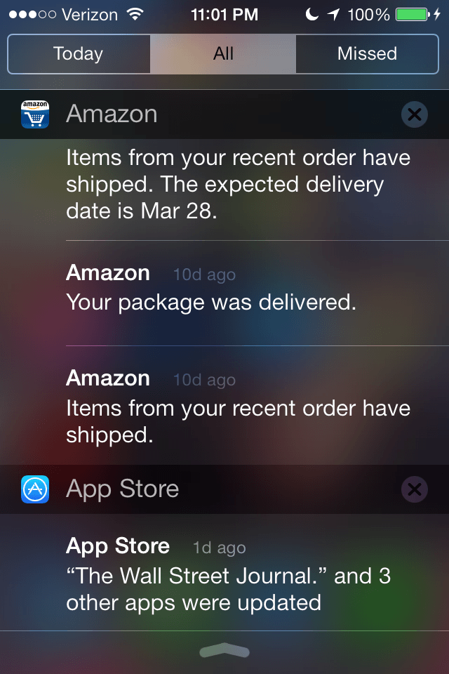
Fourth, the Android notification drawer doesn’t pile up cruft. As applications are opened and used they will clear notifications that are no longer relevant. For example, Gmail may post a notification about a new email —if the app is navigated to by any means, even independent of the notification, and the message is marked read— then Gmail will remove the notification from the notification drawer. This keeps notification pile-ups from happenning as commonly seen on iOS. Take a look at this iOS notification bar from a relatives iPhone (notice the notifications’ ages):
Android’s advanced notification drawer allows for quick, appropriate access to relevant events on the device in a simple, timely manner that doesn’t require unnessacery user-context switching. I would attribute this feature of Android as the one that keeps me from being able to leave.
Reason 3: The Back Button
A sometimes overlooked feature, this attribute of Android is invaluable in its usefulness. Besides providing a visual benefit to apps, it creates a very different navigational experience for the user than what is found on iOS.
Android also encourages its use in many scenarios outside of just application hierchy traversal. With a tap of the back button Android popup dialogs can be quickly closed, an open notification drawer can be returned to its unopen state, an obtrusive keyboard can be removed from the screen, and websites can be quickly returned to.Here is a demo where the nav bar is closed, the keyboard is closed, then the “Compose Email” screen in Gmail is exited, all done using only the back button:
The design of the back button extends to much more than full applications and influences the whole experience of Android by providing a quick means to close the existing context. The back button brings an ease to navigation that allows the user to do what they want quicker.
Reason 4: Action Items and the Overflow Menu
The Android overflow menu is another item that exhibits an influence on every Android application’s functionality. The Android actionbar contains not only the application name and icon, but a menu icon for access to a plethora of actions that can be applied to the current screen.
Here is the Gmail application with a received email currently opened:

The actions available from left to right: Archive, Delete, Mark unread, Open overflow menu. The overflow menu contains many more:
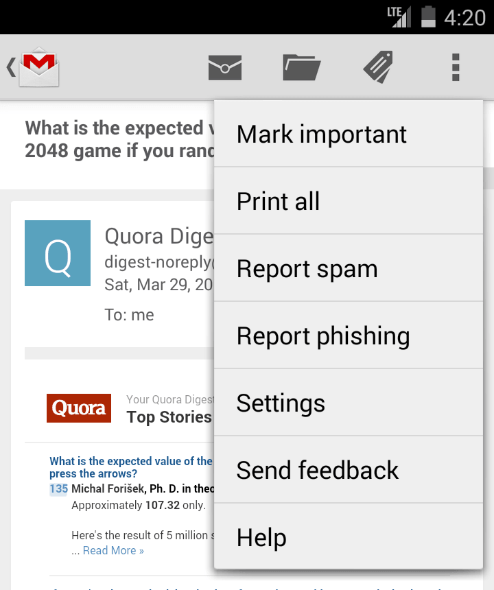
Move to, Change labels, Mark not important,… and countless others. All of these items are useful actions that the user may wish to apply to an email and the most important ones are prioritized so that they require only one tap to accomplish.
By keeping the actions easily accessible, Android diminishes the effort required by a user to execute them. It allows a user to quickly deal with the item at hand, be it deleting a spam email or calling someone that he/she is currently texting. These actions can be easily applied and the user can move on to his/her next thing.
The functionality of the actionbar items is apparent when one compares the same application from both iOS and Android. Here’s the application app for iOS:

And here’s the same application on Android:

The Android version makes performing actions on the content much easier than the iOS one. Even though the iOS one does have some analogous action items, it doesn’t have the full breadth of options as presented in the Android one. Typically, the actions must be hidden away or parried down in order to fit.
Reason 5: The Share Menu
By far one of the most useful features of Android, and easily one of the most robust, Android’s sharing functionality is unmatched in the mobile OS arena. Android applications are built around objects called Intents, packages of information that are used to launch, transition, and provide information to Android apps. Android uses specific Intents every time that it launches an application from the homescreen, but even more powerfully, Android applications can register to handle more generic Intents, actions such as the “Send an Email” Intent or the “Open this URL” Intent. This feature of Android is massively powerful and is baked throughly into the Android experience.
When an Android user is browsing photos in their gallery and wishes to share the photo with a friend, the user will click the ubiquidous Android share icon and be presented with a wide variety of means by which to share the photo.
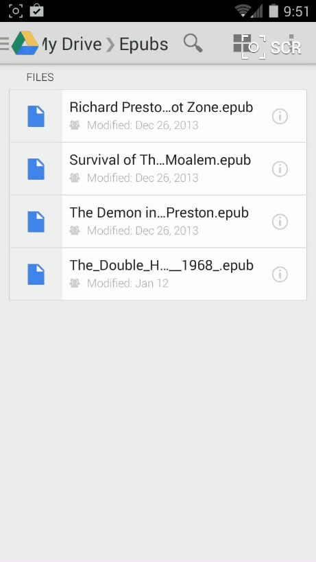
These can range from creating a new email, to posting on Facebook, to inserting it into a note with Evernote. There is a multitude of standardized actions like this that applications can register for on Android. Applications can handle common features such as photo sharing, but can also expand to more advanced actions, such as opening a PDF file from a file browser. These interactions between Android applications allow users to transition seamlessly between different applications that are better suited for various roles. Unlike iOS, where a user wishing to open an ‘.epub’ file on their Google Drive account must:
- instead open the eBook reading application
- then hope that it has suport for loading files from Google Drive
- and possibly have to install another app that does
the Android user:
- opens the Google Drive app
- selects the file
- and is effortlessly transitioned to the appropraite eBook reading application
The Android eBook application did not have to have explicit Google Drive support —it didn’t even need to know where the file came from— all it had to do was open the file provided to it in the Intent sent from the Google Drive app. This feature allows Android to provide comprehensive support between the various services that a user can come across throughout their day.
Android takes this feature even farther by allowing users to install applications that handle core smartphone components such as texting, phone calls, web browsing, taking photos and the homescreen. An Android user can install an application such as Hello SMS and replace the default text messaging application that comes on their phone. Many Android users use this feature to install the Google Chrome browser in place of the less-feature filled, default Android one —something that users on iOS are unable to do. This powerful capability allows for users to customize their phone to their needs and replace elements that are not suited to the user’s ideal experience.
Closing
All-in-all, Android may not get the crown f0r “Most Beautiful mobile OS” (though it’s coming closer with each new iteration), but it has a wide range of functionality that makes the entire user experience efficient, simple and cohesive. By:
- not wrenching users away from their current context with encroaching alerts
- providing a useful, up-to-date view of current activity
- presenting a breadth of options to respond to that current activity
- offering direct access to actions applying to the screen at-hand
- creating an intrinsicly communicative framework through which every application can connect
Android establishes a user experience that allows users to know what is going on, act on that information, quickly return to their task, do meaningul work, and seamlessly share the result.